The aim here is to analyze Titanic survivor data and identify the factors influencing survival. Also, we'll explore various data visualization tools in Python to generate graphical representations of the data
import pandas as pd
import numpy as np
import matplotlib.pyplot as plt
import seaborn as sns
from scipy.stats import spearmanr
from IPython.display import HTML, display
from pandas import Series, DataFrame
# turn off matplotlib interactive mode
plt.ioff()
Lets load the file into a Pandas dataframe and look into the contents of first few rows and try to understand the structure of the data
# Read the file
raw_df = pd.read_csv("train.csv")
raw_df.name = "Titanic Passenger Data"
# Structure of the raw data
display(HTML(raw_df.head().to_html()))
Output:
So we have the following initial attributes:
a) Passenger Id : unique identifier for passenger
b) Survived : 0 -> Died, 1 -> Survived
c) Pclass : Indicates Passenger Class. Has values 1,2,3 indicating 1st, 2nd and 3rd class
d) Name : Passenger Name
e) Sex : male/female
f) Age : Numeric value indicating age in years
g) SibSp : indicates number of siblings/spouse travelling with the passenger
h) Parch : indicates number of parents/children travelling with the passenger
i) Ticket : The ticket number
j) Fare : Fare paid
k) Cabin : The cabin number
l) Embarked : The boarding port ( S -> Southampton, C -> Cherbourg, Q -> Queenstown)
Let's look at some of those attributes in details:
Name:
display(HTML(raw_df[['Name']].head().to_html()))
Output:
Clearly the names are in the format : {Surname}, {Title}. {Name} (Alias) We can parse the names to extract the salutations/titles and family names if needed
Cabin:
cabins = raw_df[['Cabin']]
cabins = cabins[cabins['Cabin'].notnull()]
display(HTML(cabins.head().to_html()))
Output:
Clearly the cabins have an alphabetic prefix and a numeric suffix
If we extract the first characters and look for distinct values, here's what we get :
cabin_first_char = cabins['Cabin'].str[0]
print(cabin_first_char.value_counts())
Output:
C 59
B 47
D 33
E 32
A 15
F 13
G 4
T 1
Name: Cabin, dtype: int64
So we have 8 distinct values : A-G and T
So these prefixes were most likely to be deck numbers and T is probably an outlier value which was erroneously populated or it might indicate either boat deck or cargo deck .
Fare:
Some of passengers have fare as 0.0. Maybe they were ship crew and not passengers ? Lets take at closer look at the data for passengers with fare as zero
no_fare = raw_df[raw_df['Fare']==0]
display(HTML(no_fare.to_html()))
Output:
Many of them have ticket number as "LINE" - Maybe they were White Star Line Employees or ship crews. Also all of them boarded the ship from Southampton(S) which is the starting point of the ship
So we can engineer a feature called "Is Employee" based on fare amount is zero or not
Ticket:
tickets = raw_df[['Ticket']]
tickets = tickets[tickets['Ticket'].notnull()]
display(HTML(tickets.head(10).to_html()))
Output:
Ticket data doesn't indicate any consistent pattern or prefix or suffix. Mostly its numeric but in some cases have prefix. Cant identify a pattern to engineer a feature out of it
Engineered Attributes:
Based on the data we can engineer the following additional attributes :
a) Age Group : While we have Age information, we need to bin the data into categories based on age and check if certain groups fared better at survival compared to others
c) Title : We can extract it from name. That will also tell us if people with royal/nobility background were given preference ? or if military officers fared better than others and so on
d) Deck : We can extract deck from first characters of Cabin values
e) Family Size : Family Size = 1 + no of siblings/spouse + no of parents/children
f) Is Employee : Passengers with fare as 0
The data contains a number of columns whose names are are not very intuitive like SibSb, Parch, Pclass etc. Need to rename the column labels to make it more intuitive
Also instead of using the default monotonic integer index, we can switch to Passenger Id as the index
# set index
if ("PassengerId" in raw_df.columns) : # this if helps if we accidentally run it twice
raw_df.set_index("PassengerId", inplace=True)
raw_df.index.name = "PassengerId"
# rename columns meaningfully
raw_df = raw_df.rename(columns = {'SibSp':'Siblings/Spouse', 'Parch':'Parents/Children', 'Pclass':'Passenger Class'})
Lets check if the data has duplicate rows, if so, we'll remove duplicates from the data
# Check if data has duplicates
dup_count = raw_df.duplicated().sum()
has_duplicates = (dup_count != 0)
print(has_duplicates)
Output:
False
So the data has no duplicate rows. Next we need to check if some of the columns have no values/junk values
plt.cla()
plt.clf()
missing_data = raw_df.isnull().sum()
ax = missing_data.plot(kind = 'bar', rot=60, colormap='summer')
ax.set_ylim(0, 800) # we have 891 rows in total so 800 should be a good limit
plt.title("NA counts")
for p in ax.patches:
ax.annotate("%.0f" % p.get_height(), (p.get_x() + p.get_width() / 2., p.get_height()), ha='center', va='center', xytext=(0, 10), textcoords='offset points')
plt.show()
Output:

Clearly Age, Cabin and Embarked has missing values We need to check if these variables are relevant to our analysis. If so, we need a strategy to fill those missing values. Else, we can drop them
Age : Likely to be relevant. We can fill the missing values with mean/median but that might be incorrect
Cabin : Cabin Number in itself is unlikely to be relevant to our analysis. But the cabin numbers indicate a pattern - a letter prefix (which might be the Deck number) and a suffix. The deck number might be relevant to our analysis (Passengers occupying deck closest to lifeboats might have better survival rate or so on)
Embarked : There are only 2 missing values. We can assume central tendency prevails and populate them with the mode (value with highest frequency)
Lets check the commonest embark point first
# check most frequent Embark point
plt.cla()
plt.clf()
embarked = raw_df["Embarked"].value_counts()
most_embarked = embarked.index[0]
embarked.rename(embarked_dict, inplace=True)
ax = embarked.plot(kind='bar', rot=60)
ax.set_ylim(0, 800) # we have 891 rows in total so 800 should be a good limit
plt.title("Embark point vs Number of Passengers")
for p in ax.patches:
ax.annotate("%.0f" % p.get_height(), (p.get_x() + p.get_width() / 2., p.get_height()), ha='center', va='center', xytext=(0, 10), textcoords='offset points')
plt.show()
Output:
Clearly Southampton(S) was the most popular embarking point. So we can populate the missing values as 'Southampton'
raw_df["Embarked"].fillna(value=most_embarked, inplace=True)
We can extract the salutation/titles (Ms, Mr, Master etc) from the names and use the mean age for a title to fill up the corresponding missing ages. It still is an approximation but its a better approximation that using overall mean/median value
# This if condition helps in case we run this block twice
if ('Title' not in raw_df.columns) :
titles = pd.DataFrame(raw_df.apply(lambda x: (x["Name"].split(",")[1].split(".")[0]).strip(), axis=1), columns=["Title"])
# show count of titles
print("There are {} unique titles.".format(titles['Title'].nunique()))
# show unique titles
print("\n", titles['Title'].unique())
print("\n")
# group some of the titles together
titles['Title'].replace({"Mlle":"Miss", "Ms" : "Miss", "Mme" : "Mrs" }, inplace=True)
titles['Title'].replace(["Col","Major","Capt"],"Military", inplace=True)
titles['Title'].replace(["the Countess","Lady","Sir","Jonkheer","Don"],"Nobles", inplace=True)
titles['Title'].replace(["Rev"], "Priest", inplace=True)
raw_df = raw_df.join(titles)
mean_ages = raw_df.groupby('Title')['Age'].mean()
print("Mean age per title",mean_ages,sep="\n")
Output:
There are 17 unique titles.
['Mr' 'Mrs' 'Miss' 'Master' 'Don' 'Rev' 'Dr' 'Mme' 'Ms' 'Major' 'Lady'
'Sir' 'Mlle' 'Col' 'Capt' 'the Countess' 'Jonkheer']
Mean age per title
Title
Dr 42.000000
Master 4.574167
Military 56.600000
Miss 21.845638
Mr 32.368090
Mrs 35.788991
Nobles 41.600000
Priest 43.166667
Name: Age, dtype: float64
We can use this information to fillup the missing ages
raw_df.loc[(raw_df['Age'].isnull()) & (raw_df['Title']=='Dr'),'Age']=mean_ages.loc['Dr']
raw_df.loc[(raw_df['Age'].isnull()) & (raw_df['Title']=='Master'),'Age']=mean_ages.loc['Master']
raw_df.loc[(raw_df['Age'].isnull()) & (raw_df['Title']=='Military'),'Age']=mean_ages.loc['Military']
raw_df.loc[(raw_df['Age'].isnull()) & (raw_df['Title']=='Miss'),'Age']=mean_ages.loc['Miss']
raw_df.loc[(raw_df['Age'].isnull()) & (raw_df['Title']=='Mr'),'Age']=mean_ages.loc['Mr']
raw_df.loc[(raw_df['Age'].isnull()) & (raw_df['Title']=='Mrs'),'Age']=mean_ages.loc['Mrs']
raw_df.loc[(raw_df['Age'].isnull()) & (raw_df['Title']=='Nobles'),'Age']=mean_ages.loc['Nobles']
raw_df.loc[(raw_df['Age'].isnull()) & (raw_df['Title']=='Priest'),'Age']=mean_ages.loc['Priest']
Now lets categorize age into groups. Lets get max and min age first
max_age = raw_df['Age'].max()
print("Max Age",max_age,sep=" : ")
min_age = raw_df['Age'].min()
print("Min Age",min_age,sep=" : ")
Output:
Max Age : 80.0
Min Age : 0.42
So we can divide the passengers into following age groups :
Child : 0 to 10
Young Adult : 10 to 20
Youth : 20 - 35
Middle Aged : 35 - 60
Senior : 60 and above
bins = [0, 10, 20, 35, 60, 81]
raw_df['Age Group'] = pd.cut(raw_df['Age'], bins, labels = ['Child','Young Adult','Youth','Middle Aged','Senior'])
display(HTML(raw_df.head().to_html()))
Next we need to populate Family Size based on Siblings/Spouse and Parents/Children
Family Size should be [Siblings/Spouse] + [Parents/Children] + 1 (self)
# family size
fsize = pd.DataFrame(raw_df.apply(lambda x: x['Siblings/Spouse'] +x['Parents/Children'] + 1, axis=1), columns=["Family Size"])
# this if condition helps in case i run it twice
if ('Family Size' not in raw_df.columns) :
raw_df = raw_df.join(fsize)
Now we'll extract 'Is Employee' attribute values from data. We'll assume anybody with fare == 0 as employee
raw_df["Is Employee"] = raw_df["Fare"] == 0
Let's extract deck information from cabin number:
raw_df['Deck']=raw_df['Cabin'].str[0]
Do we have attributes conveying the same information ?
We have two columns : 'Fare' and 'Passenger Class'. We need to check if both of them are conveying the same information (ie if they are perfectly or almost perfectly correlated) If they are conveying the same information, we can drop one of them while keeping the other
Lets get a correlation matrix between Fare and Passenger Class
corr_matrix = raw_df[['Fare','Passenger Class']].corr().round(2)
plt.cla()
plt.clf()
f = plt.figure(figsize=(3,2))
sns.heatmap(corr_matrix, center=0, annot=True, cmap='summer')
plt.title("Correlation Matrix : fare vs passenger class")
plt.show()
Output:
The correlation value is negative which is expected (Class 3 fare will be lower than class 1 fare ... and so on) The correlation coefficient is reasonably high (0.55) but nowhere close to 1. Maybe, fare really means total fare and not necessarily fare per passenger. If that's the case, then for passengers travelling together, fare (and maybe ticket number as well) should be same.
fare_data = raw_df[['Passenger Class','Age','Family Size','Ticket','Fare']].copy()
fare_data = fare_data[fare_data['Family Size']>1]
fare_data = pd.DataFrame({'Count': fare_data.groupby(['Family Size', 'Ticket', 'Fare']).size()})
fare_data.sort_values(by = ['Ticket'])
display(HTML(fare_data.tail(20).to_html()))
Clearly there are a lot of cases where multiple people share the same ticket number and fare. So lets calculate fare per passenger.
raw_df['Fare Per Passenger']=raw_df['Fare']/raw_df['Family Size']
Lets calculate the correlation matrix again - this time between Fare per Passenger and Family Size
corr_matrix = raw_df[['Fare Per Passenger','Passenger Class']].corr().round(2)
plt.cla()
plt.clf()
f = plt.figure(figsize=(3,2))
sns.heatmap(corr_matrix, center=0, annot=True, cmap='summer')
plt.title("Correlation Matrix : fare-per-passenger vs passenger class")
plt.show()
Strangely the correlation has actually gone down which probably means there are a lot of outliers in the Fare data
Lets look at a KDE plot for Fare Per Passenger
plt.cla()
plt.clf()
sns.distplot(raw_df['Fare Per Passenger'], kde=True)
plt.title("Fare per passenger : value distribution")
plt.show()
Clearly there are outlier values particularly towards the higher end of fares. Also lets look at this :
raw_df['Fare Per Passenger'].describe()
Output:
count 891.000000
mean 19.916375
std 35.841257
min 0.000000
25% 7.250000
50% 8.300000
75% 23.666667
max 512.329200
Name: Fare Per Passenger, dtype: float64
While 75 % of values are within 23.67, the max value is 512.32. Clearly this is an outlier. Lets look at median fares per class
fare_1 = raw_df[raw_df["Passenger Class"] == 1]['Fare Per Passenger'].median()
print("Median 1st class fare :",fare_1)
fare_2 = raw_df[raw_df["Passenger Class"] == 2]['Fare Per Passenger'].median()
print("Median 2nd class fare :",fare_2)
fare_3 = raw_df[raw_df["Passenger Class"] == 3]['Fare Per Passenger'].median()
print("Median 3rd class fare :",fare_3)
Output:
Median 1st class fare : 33.760400000000004
Median 2nd class fare : 13.0
Median 3rd class fare : 7.75
How do we define outliers ? One easy way to define outliers would be to calculate the IQR and consider anything above 2.5 times IQR as an outlier
q25, q75 = np.percentile(raw_df['Fare Per Passenger'], 25), np.percentile(raw_df['Fare Per Passenger'], 75)
print("Inter Quartile Range :",q25, "-", q75)
iqr = q75 - q25
cut_off = iqr * 2.5
upper_limit = cut_off + q75
print("Upper cut off limit :",upper_limit)
Output:
Inter Quartile Range : 7.25 - 23.666666666666668
Upper cut off limit : 64.70833333333334
Now we can replace the outlier high values with median first class fare
raw_df.loc[raw_df['Fare Per Passenger']>upper_limit, 'Fare Per Passenger'] = np.nan
raw_df['Fare Per Passenger'].fillna(fare_1, inplace=True)
Now lets look at overall statistics and KDE curve
raw_df['Fare Per Passenger'].describe()
Output:
count 891.000000
mean 14.918177
std 12.473324
min 0.000000
25% 7.250000
50% 8.300000
75% 23.666667
max 56.929200
Name: Fare Per Passenger, dtype: float64
Lets generate the KDE curve again
plt.cla()
plt.clf()
sns.distplot(raw_df['Fare Per Passenger'], kde=True)
plt.title("Fare per passenger : value distribution")
plt.show()
Now the fare distribution looks a lot less skewed
Calculating the correlation matrix again
corr_matrix = raw_df[['Fare Per Passenger','Passenger Class']].corr().round(2)
plt.cla()
plt.clf()
f = plt.figure(figsize=(3,2))
sns.heatmap(corr_matrix, center=0, annot=True, cmap='summer')
plt.title("Correlation Matrix : Fare-per-passenger vs Passenger Class")
plt.show()
Clearly Fare/Fare per Passenger and Passenger Class are highly correlated (0.77) and are probably representing the same attribute. So we can drop Fare and Fare per passenger
Were people treated differently based on title/salutation? Did nobles or doctors or military personnel have a better chance of survival ?
We can do a rudimentary analysis to check if Titles were relevant to survival. If not we can drop the Title information from the dataset
plt.cla()
plt.clf()
f, axes = plt.subplots(1, 2 , figsize=(16,5))
grouped_by_titles = raw_df.groupby('Title').agg('mean')
ax0 = grouped_by_titles['Survived'].plot(kind='bar', ax = axes[0])
ax0.set_ylim(0, 1)
ax0.set_title('Title vs probability of survival')
for p in ax0.patches:
ax0.annotate("%.2f" % p.get_height(), (p.get_x() + p.get_width() / 2., p.get_height()), ha='center', va='center', xytext=(0, 10), textcoords='offset points')
summed_by_title = raw_df.groupby('Title').agg('sum')
ax1 = summed_by_title['Survived'].plot(kind='bar', ax = axes[1])
ax1.set_ylim(0,150)
ax1.set_title('Title vs number of survivors')
for p in ax1.patches:
ax1.annotate("%.0f" % p.get_height(), (p.get_x() + p.get_width() / 2., p.get_height()), ha='center', va='center', xytext=(0, 10), textcoords='offset points')
plt.show()

None of the priests survived. Nobles do have a higher probability of survival. However because of the extremely small absolute number of nobles/priests/doctors/military personnel, the data may be skewed. Hence we can drop the column from the purview of our analysis
Is Deck info relevant to survival ? If not then we can drop it from the data
plt.cla()
plt.clf()
f, axes = plt.subplots(1, 2 , figsize=(16,5))
grouped_by_deck = raw_df.groupby('Deck').agg('mean')
ax0 = grouped_by_deck['Survived'].plot(kind='bar', ax = axes[0])
ax0.set_ylim(0, 1)
ax0.set_title('Deck vs probability of survival')
for p in ax0.patches:
ax0.annotate("%.2f" % p.get_height(), (p.get_x() + p.get_width() / 2., p.get_height()), ha='center', va='center', xytext=(0, 10), textcoords='offset points')
summed_by_deck = raw_df.groupby('Deck').agg('sum')
ax1 = summed_by_deck['Survived'].plot(kind='bar', ax = axes[1])
ax1.set_ylim(0,50)
ax1.set_title('Deck vs number of survivors')
for p in ax1.patches:
ax1.annotate("%.0f" % p.get_height(), (p.get_x() + p.get_width() / 2., p.get_height()), ha='center', va='center', xytext=(0, 10), textcoords='offset points')
plt.show()
There might be some correlation between Deck Number and Survival but the absolute number of survivors indicate that the sample size is too small
77 % of values in the column have no data. So, we are working on a small subset of data and hence our analysis can be skewed
So we are dropping off the following attributes :
Built-in attributes :
Name : Name in itself has no impact on survival. And we have already captured the title as a separate attribute
Ticket : There's no pattern to engineer additional attributes out of it. Ticket number in itself should not impact survival
Cabin : Extracted Deck information separately. Also Cabin data is missing for 77 % passengers and available mostly for first class passengers. So sample size is too small and highly skewed
Fare : Extracted Fare per Passenger as a separate attribute
Engineered attributes:
Deck : Deck has some correlation with survival but deck data is missing for 77 % passengers and available mostly for first class passengers. So sample size is too small and highly skewed
Title : Part of Title inofrmation is captured in other information like Sex and Age Group. Special Titles might have correlation with survival but the size of the data is too small
Fare per Passenger : Because it has very high correlation with Passenger Class (0.77), its probably representing the same information as Passenger Class
df = raw_df.drop(['Name','Ticket','Cabin','Fare','Title','Deck','Fare Per Passenger'], axis=1)
Now our dataset structurally looks like this:
Survival Analysis
Overall, survival stats look like this:
plt.cla()
plt.clf()
ax = plt.gca()
labels = ['Survived','Died']
survived_count = df[df['Survived'] == 1].shape[0]
dead_count = df[df['Survived'] == 0].shape[0]
total = df.shape[0]
abs_data = [survived_count, dead_count]
prob_data = [survived_count/total, dead_count/total]
explode = (0, 0.1)
ax.pie(abs_data, explode=explode, labels=labels, autopct='%1.2f%%', shadow=True, startangle=90)
ax.axis('equal')
ax.set_title("Survived vs Dead")
plt.show()
Output:
The variables to analyze are :
Passenger Class
Sex
Age
Siblings/Spouse
Parents/Children
Embarked
Fare Per Passenger
Family Size
Child/Adult
Lets look at distribution curves for this variables and check if we have reasonably sized data for analysis for each of these variables
plt.cla()
plt.clf()
fig, axes = plt.subplots(3,3, figsize=(25, 20))
sns.countplot('Passenger Class', data=df, ax=axes[0,0])
sns.countplot('Sex', data=df, ax=axes[0,1])
sns.distplot(df['Age'], kde=True, ax=axes[0,2])
sns.countplot('Siblings/Spouse', data=df, ax=axes[1,0])
sns.countplot('Parents/Children', data=df, ax=axes[1,1])
sns.countplot('Embarked', data=df, ax=axes[1,2])
sns.countplot('Family Size', data=df, ax=axes[2,0])
sns.countplot('Age Group', data=df, ax=axes[2,1])
sns.countplot('Is Employee', data=df, ax=axes[2,2])
From the plots above we can clearly see that there's enough data in our dataset to analyze impact of each of these variables on survival ( Except maybe Is Employee - for which data is highly skewed)
Now lets look at plots of each of these variables against survival data
plt.cla()
plt.clf()
fig, axes = plt.subplots(3,3, figsize=(25, 20))
df.groupby('Passenger Class')['Survived'].mean().plot(kind="barh", ax=axes[0,0], xlim=(0,1))
df.groupby('Sex')['Survived'].mean().plot(kind="barh", ax=axes[0,1], xlim=(0,1))
sns.boxplot(x="Survived", y="Age", data=df, ax=axes[0,2])
df.groupby('Siblings/Spouse')['Survived'].mean().plot(kind="barh", ax=axes[1,0], xlim=(0,1))
df.groupby('Parents/Children')['Survived'].mean().plot(kind="barh", ax=axes[1,1], xlim=(0,1))
df.groupby('Embarked')['Survived'].mean().plot(kind="barh", ax=axes[1,2], xlim=(0,1))
df.groupby('Family Size')['Survived'].mean().plot(kind="barh", ax=axes[2,0], xlim=(0,1))
df.groupby('Age Group')['Survived'].mean().plot(kind="barh", ax=axes[2,1], xlim=(0,1))
df.groupby('Is Employee')['Survived'].mean().plot(kind="barh", ax=axes[2,2], xlim=(0,1))
plt.show()
Also lets look at a heatmap showing correlation matrix between the variables
In order to do that we need to replace textual categorical data with their numerical equivalents like this
sex = {"male": 1, "female": -1}
embarked = {"S":0, "Q":1, "C":2}
agegroup = {'Child':1, 'Young Adult':2, 'Youth':3, 'Middle Aged':4, 'Senior':5}
plt.cla()
plt.clf()
#in order to generate heatmap we need numeric values
genders = {"male": 1, "female": -1}
embark_numeric = {"S":0, "Q":1, "C":2}
age_group = {'Child':1, 'Young Adult':2, 'Youth':3, 'Middle Aged':4, 'Senior':5}
df_num = df.copy()
df_num["Sex"] = df["Sex"].map(genders)
df_num["Embarked"]=df["Embarked"].map(embark_numeric)
df_num["Age Group"]=df["Age Group"].map(age_group)
corr_matrix = df_num[['Survived','Passenger Class','Sex','Age','Siblings/Spouse','Parents/Children','Embarked','Family Size', 'Age Group','Is Employee']].corr().round(2)
fig = plt.figure(figsize = (10,10))
sns.heatmap(corr_matrix, annot=True, center=0, square=True, cmap="summer")
plt.title("Correlation Matrix")
plt.show()
Clearly the 2 most significant (in-terms of absolute value of correlation coefficient) parameters inflencing survival are :
Sex (0.54)
Passenger Class (0.34)
Now, lets look at each of these factors in detail
Sex
sex_vs_survived = pd.DataFrame({'Count': df.groupby(['Sex','Survived']).size()})
sex_vs_survived_sum = sex_vs_survived.sum(level=0, axis=0)
sex_vs_survived['Probability'] = 0
sex_vs_survived.loc[('female', 0),'Probability']=sex_vs_survived.loc[('female', 0),'Count']/sex_vs_survived_sum.loc['female', 'Count']
sex_vs_survived.loc[('female', 1),'Probability']=sex_vs_survived.loc[('female', 1),'Count']/sex_vs_survived_sum.loc['female', 'Count']
sex_vs_survived.loc[('male', 0),'Probability']=sex_vs_survived.loc[('male', 0),'Count']/sex_vs_survived_sum.loc['male', 'Count']
sex_vs_survived.loc[('male', 1),'Probability']=sex_vs_survived.loc[('male', 1),'Count']/sex_vs_survived_sum.loc['male', 'Count']
display(HTML(sex_vs_survived.to_html()))
Clearly women had a better shot at survival as compared to men. Women lead mean both in terms of absolute number as well as percentage of survivors. Lets look at a graphical representation of this data
plt.cla()
plt.clf()
survival_palette = {1: "green", 0: "orange"} # Color map for visualization
sns.countplot('Sex', hue='Survived', data=df, palette=survival_palette)
plt.title('Sex : Survived vs Dead : Absolute Values')
plt.show()

plt.cla()
plt.clf()
plt.title("Sex vs Probability of Survival")
grouped_by_class = df.groupby('Sex').agg('mean')
ax = grouped_by_class["Survived"].plot(kind='bar', rot=60)
ax.set_ylim(0, 0.8)
for p in ax.patches:
ax.annotate("%.2f" % p.get_height(), (p.get_x() + p.get_width() / 2., p.get_height()), ha='center', va='center', xytext=(0, 10), textcoords='offset points')
plt.show()
Passenger Class
Lets look at number of Survived/Dead passengers per class
pclass_vs_survived = pd.DataFrame({'Count': df.groupby(['Passenger Class','Survived']).size()})
pclass_vs_survived_sum = pclass_vs_survived.sum(level=0, axis=0)
pclass_vs_survived['Probability'] = 0
pclass_vs_survived.loc[(1, 0),'Probability']=pclass_vs_survived.loc[(1, 0),'Count']/pclass_vs_survived_sum.loc[1, 'Count']
pclass_vs_survived.loc[(1, 1),'Probability']=pclass_vs_survived.loc[(1, 1),'Count']/pclass_vs_survived_sum.loc[1, 'Count']
pclass_vs_survived.loc[(2, 0),'Probability']=pclass_vs_survived.loc[(2, 0),'Count']/pclass_vs_survived_sum.loc[2, 'Count']
pclass_vs_survived.loc[(2, 1),'Probability']=pclass_vs_survived.loc[(2, 1),'Count']/pclass_vs_survived_sum.loc[2, 'Count']
pclass_vs_survived.loc[(3, 0),'Probability']=pclass_vs_survived.loc[(3, 0),'Count']/pclass_vs_survived_sum.loc[3, 'Count']
pclass_vs_survived.loc[(3, 1),'Probability']=pclass_vs_survived.loc[(3, 1),'Count']/pclass_vs_survived_sum.loc[3, 'Count']
display(HTML(pclass_vs_survived.to_html()))
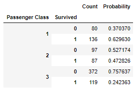
Clearly first and second class passengers had a significantly higher chance of survival as compared to 3rd class passengers
plt.cla()
plt.clf()
survival_palette = {0: "black", 1: "orange"} # Color map for visualization
sns.countplot('Passenger Class', hue='Survived', data=df, palette=survival_palette)
plt.title('Passenger Class : Survived vs Dead : Absolute Values')
plt.show()
From this diagram it is not very clear because of relatively low number of first and second class passengers. Lets look at another view of the data
plt.cla()
plt.clf()
plt.title("Passenger Class vs Probability of Survival")
grouped_by_class = df.groupby('Passenger Class').agg('mean')
ax = grouped_by_class["Survived"].plot(kind='bar', rot=60)
ax.set_ylim(0, 0.8)
for p in ax.patches:
ax.annotate("%.2f" % p.get_height(), (p.get_x() + p.get_width() / 2., p.get_height()), ha='center', va='center', xytext=(0, 10), textcoords='offset points')
plt.show()
This clearly indicates that 1st and 2nd class passengers were given priority during rescue
Now lets take a look at other minor features :
Age
Age Group
Siblings/Spouse
Parents/Children
Family Size
Embarked
Age and Age Group
Maybe children were treated with priority irrespective of gender and passenger class. Lets see if the data confirms this
plt.cla()
plt.clf()
f,ax=plt.subplots(1,2,figsize=(18,8))
sns.violinplot('Passenger Class','Age',hue='Survived',data=df ,split=True ,ax=ax[0])
ax[0].set_title('Passenger Class and Age vs Survived')
ax[0].set_yticks(range(0,110,10))
sns.violinplot("Sex","Age", hue="Survived", data=df ,split=True ,ax=ax[1])
ax[1].set_title('Sex and Age vs Survived')
ax[1].set_yticks(range(0,110,10))
plt.show()
Clearly children under age of 10 have a relatively high survival rate (more children survived than died) irrespective of class
Male children under age 10 have high survival rate (more children survived than died) but that's not the case with female children
plt.cla()
plt.clf()
survival_palette = {0: "black", 1: "orange"} # Color map for visualization
sns.countplot('Age Group', hue='Survived', data=df, palette=survival_palette)
plt.title('Age Group : Survival Numbers : Absolute Values')
plt.show()
Clearly more young people died than survived. This plot doesnt tell us much about survival of children because there are so few children compared to number of adults
plt.cla()
plt.clf()
plt.title("Age Group vs Probability of Survival")
grouped_by_child_adult = df.groupby('Age Group').agg('mean')
ax = grouped_by_child_adult["Survived"].plot(kind='bar', rot=60)
ax.set_ylim(0, 0.8)
for p in ax.patches:
ax.annotate("%.2f" % p.get_height(), (p.get_x() + p.get_width() / 2., p.get_height()), ha='center', va='center', xytext=(0, 10), textcoords='offset points')
plt.show()
Clearly children were much more likely to survive than adults
plt.cla()
plt.clf()
sns.kdeplot(df['Age'], shade=False, label='Age distribution')
sns.kdeplot(df.loc[df['Survived']==1, 'Age'], shade=False, label='Survived distribution')
plt.title("Age and Survived distribution")
plt.xlim(0,80)
plt.show()
Overall Age doesn't seem to have much impact on survival except for two relative outliers :
Family Size/Parents and Children/Siblings and Spouse
plt.cla()
plt.clf()
pd.crosstab(df['Family Size'], df['Survived']).plot(kind='bar', stacked=True, title="Survived vs Family size")
pd.crosstab(df['Family Size'], df['Survived'], normalize='index').plot(kind='bar', stacked=True, title="Survived vs Family size (%)")
plt.show()
Even though family size overall has low correlation with survival, it seems that for families with 1 to 4 people, larger family size increases survival rates. But for families of 5 and up, survival rates is much lower.
Lets visualize the family data in combination with Sex and Passenger Class
plt.cla()
plt.clf()
female = df[df['Sex'] == 'female']
male = df[df['Sex'] == 'male']
f,ax=plt.subplots(1,2,figsize=(12,6),sharey=True)
pd.crosstab(female['Family Size'], female['Survived']).plot(kind='bar', stacked=True, title="Female", ax=ax[0])
pd.crosstab(male['Family Size'], male['Survived']).plot(kind='bar', stacked=True, title="Male", ax=ax[1])
f,ax=plt.subplots(1,2,figsize=(12,6),sharey=True)
pd.crosstab(female['Family Size'], female['Survived'], normalize = 'index').plot(kind='bar', stacked=True, title="Female", ax=ax[0])
pd.crosstab(male['Family Size'], male['Survived'], normalize = 'index').plot(kind='bar', stacked=True, title="Male", ax=ax[1])
plt.show()
Clearly for both sex, family sizes of 5 and up lead to low survival rates. For females in families up to 4, the survival rate is about 80%, regardless of family size. For males in families up to 4, the survival rate increases with family size
plt.cla()
plt.clf()
class1 = df[df['Passenger Class'] == 1]
class2 = df[df['Passenger Class'] == 2]
class3 = df[df['Passenger Class'] == 3]
f,ax=plt.subplots(1,3,figsize=(18,6),sharey=True)
pd.crosstab(class1['Family Size'], class1['Survived']).plot(kind='bar', stacked=True, title="First Class", ax=ax[0])
pd.crosstab(class2['Family Size'], class2['Survived']).plot(kind='bar', stacked=True, title="Second Class", ax=ax[1])
pd.crosstab(class3['Family Size'], class3['Survived']).plot(kind='bar', stacked=True, title="Third Class", ax=ax[2])
f,ax=plt.subplots(1,3,figsize=(18,6),sharey=True)
pd.crosstab(class1['Family Size'], class1['Survived'], normalize = 'index').plot(kind='bar', stacked=True, title="First Class", ax=ax[0])
pd.crosstab(class2['Family Size'], class2['Survived'], normalize = 'index').plot(kind='bar', stacked=True, title="Second Class", ax=ax[1])
pd.crosstab(class3['Family Size'], class3['Survived'], normalize = 'index').plot(kind='bar', stacked=True, title="Third Class", ax=ax[2])
plt.show()


Interestingly almost none of the first or second class passengers travelled with large family For all classes, probability of survival increases with increase in family size upto a size of 4 Irrespective of family size, first class passengers have more than 50 % chance of survival
Embarked
plt.cla()
plt.clf()
pd.crosstab(df['Embarked'].map(embarked_dict), df['Survived']).plot(kind='bar', stacked=True, title="Embarked vs Survived (Absolute Numbers)", rot=60)
pd.crosstab(df['Embarked'].map(embarked_dict), df['Survived'], normalize='index').plot(kind='bar', stacked=True, title="Embarked vs Survived (%)", rot=60)
plt.show()
Lets visualize Embarked data in combination with Sex and Passenger Class
plt.cla()
plt.clf()
df1 = df.copy()
df1['Embarked'] = df['Embarked'].map(embarked_dict)
fg = sns.FacetGrid(df1, row='Embarked', size=4.5, aspect=1.6)
fg.map(sns.pointplot, 'Passenger Class', 'Survived', 'Sex', palette=None, order=None, hue_order=None )
fg.add_legend()
plt.show()
Interestingly, women boarding at Queenstown and Southampton fared better than men at survival. But the opposite is true for Cherbourg Men borading at Cherbourg survived whereas men boarding at Southampton and Queensbury mostly perished
Is Employee
iscrew_vs_survived = pd.DataFrame({'Count': df.groupby(['Is Employee','Survived']).size()})
iscrew_vs_survived_sum = iscrew_vs_survived.sum(level=0, axis=0)
iscrew_vs_survived['Probability'] = 0
iscrew_vs_survived.loc[(True, 0),'Probability']=iscrew_vs_survived.loc[(True, 0),'Count']/iscrew_vs_survived_sum.loc[True, 'Count']
iscrew_vs_survived.loc[(True, 1),'Probability']=iscrew_vs_survived.loc[(True, 1),'Count']/iscrew_vs_survived_sum.loc[True, 'Count']
iscrew_vs_survived.loc[(False, 0),'Probability']=iscrew_vs_survived.loc[(False, 0),'Count']/iscrew_vs_survived_sum.loc[False, 'Count']
iscrew_vs_survived.loc[(False, 1),'Probability']=iscrew_vs_survived.loc[(False, 1),'Count']/iscrew_vs_survived_sum.loc[False, 'Count']
display(HTML(iscrew_vs_survived.to_html()))
Clearly most of the White Star Line employees perished. But the overall number of White Star Line employees/officials that we detected is too small to make a meaningful conclusion
Conclusion
Overall, the main factors that impacted survival are :
1. Sex : Women fared better than men
2. Passenger Class : Passengers in first class were more likely to survive.
3. Age Group : Children were more likely to survive compared to adults. Young people were more likely to die
4. Embarked : Women boarding from Queenstown/Southampton mostly survived, while men boarding from Cherbourg fared better than others
5. Family Size : Larger the family better the survival rate but for not for too large families (> 4)